-
Software
Compliance Software
Oversee licenses, track renewals, access documents, and more from a single interface.
Software Overview -
Services
Compliance Services
Full service compliance solutions for organizations throughout their entire lifecycles.
Services Overview -
Industries
-
Partner
- Information Center
Online Donation Form Optimization: What to Keep and What to Ditch
Any nonprofit wishing to be successful in this digital age must incorporate online initiatives into its fundraising strategy — and that means relying on online donation software.
You’ve probably come across numerous online donation tools on various nonprofit websites, so you’ve also probably seen good and not-so-good donation forms. But do you actually know what makes a form “good?”
Though the idea behind creating an online donation tool is relatively simple, there are a number of mistakes that you’ll likely encounter in practice as you are customizing your donation form.
Most errors occur in the following areas:
- Promoting your online donation form
- Formatting your online donation form
- Organizing payment amounts and types
- Handling Follow-ups
In this article, we’ll introduce common errors that many nonprofits make when setting up online donation tools — and how to avoid them like a pro.
You’ll be accepting tons of donations in no time!
Promoting your online donation form
Common error #1: The online donation tool is buried in your site.
If you want people to donate to your cause, they have to first be able to find where to go to donate!
This may seem like a no-brainer, but time and time again, we see sites that do not have a clear donation form or portal. As a result, users have trouble locating where they are supposed to go to donate.
Either the donation tool isn’t clearly visible, or it is only present in one place or page on your site. As a result, potential donors become discouraged when they aren’t able to quickly find where to go to give.
The fix: Make sure your online donation tool is prominently displayed.
Why not make it as easy as possible for visitors to give?
Within seconds of landing on any page of your organization’s website, a user should know exactly what to click on to get to the donation form.
You can (and should!) include a link to your donation page:
- At the top of the home page.
- On your “Ways To Give” page.
- In every single blog post or sub page.
- In the side and top navigation menus.
Key point: However you choose to display your donation form link, the important thing is to make sure it is easy for visitors to find or see.
Common error #2: You are only marketing your donation form on your website.
While it’s certainly important to clearly present your donation form on your actual website, some donors may be locating your organization in other ways.
In particular, donors may choose to interact with your nonprofit from social media accounts such as Facebook, Instagram, or Twitter. They may not want to leave those platforms to search for where to donate.
The fix: Take advantage of all your online accounts to direct donors to your donation page.
When trying to engage potential donors, it’s important to meet them where they are.
Your organization’s social media accounts provide one more way to promote your donation page. Include links to your donation form in your social media profile bio. Post to remind followers that they can donate to your cause during major campaigns.
Another place that should include a link to your donation form is in your nonprofit’s email promotions.
Send out donation-specific calls to action, put a donate button in your weekly email newsletters, and even include a link to your donation page in employee email signatures. Recipients are constantly getting these emails, so why not add a frequent reminder to donate into their inbox?
Key point: The bottom line is that, no matter where they are, donors should know exactly how to contribute.
Formatting your online donation form
Common error #3: The donation form doesn’t look like it is part of your site.
You’ve spent a lot of time and energy creating specific branding standards for your organization. As a result, your website uses very specific colors, fonts, and formatting.
Your donation form, however, might not.
Because of this, it may seem like donors are being directed to a completely different website — one that they weren’t trying to visit. This may cause confusion and discourage donations.
The fix: Keep your branding and appearance consistent across all parts of your website.
Donors have come to visit your site, so you want to make sure that your donation page still feels like the rest of your nonprofit’s website.
You’ll want to pick a donation form template that meshes best with your site, and you’ll want to keep your formatting and branding consistent on your donation form, just as you do with your other website pages.
Such consistent branding demonstrates to your donors that you want to give them a seamless giving experience. It shows that you care about the donation process and that you want to make it as easy as possible.
Many online donation software providers offer varying levels of customization and branding capacities so that you can craft the perfect donation page to compliment your wider website. Be sure to choose a donation software provider that’s going to offer customization options that will suit your organization the best.
Key Point: In order to offer the smoothest and most consistent donation process possible, keep your donation page in line with your nonprofit’s online branding standards.
Common error #4: Your donation form seems only concerned with processing payment.
You may have heard advice about keeping your donation form simple and to the point. After all, you certainly don’t want to bog down your donors in long, overly complicated donation pages.
While this is certainly a good point, there is a potential pitfall. Having a donation page that is too simplified and focused solely on the monetary aspect of a donation without any hint of philanthropy can be detrimental. Donors do not like to feel as though you are simply concerned with taking their money.
The fix: Be sure to remind donors of why they were inspired to give in the first place.
This blog has previously featured resources on successfully marketing your nonprofit, and one of the biggest tips was to “incorporate donor-centric language whenever it’s relevant…to make your supporters feel like the heroes of your success story.”
This also applies to your donation form!
A good donation form (briefly) tells the story or mission of the nonprofit, and helps to remind donors what cause they are giving to.
Add in a line or two letting donors know what their donation amount is funding — whether it be a backpack of school supplies for a child in need or a hot meal for a homeless shelter.
If you can, allow donors to “see” exactly what their money is going towards by placing a relevant, feel-good image of the people, animals, or communities you serve at the top of the donation form. Take a look at how Hoopzkid formatted their donation site for a great example:
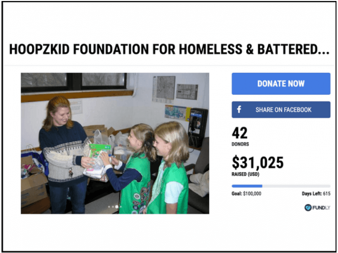
While you still want to keep copy short and maintain a clean-looking page, reminding donors why they are giving in the first place increases the likelihood that they will make it all the way through the donation form.
Key point: Your donation page should hearken back to the philanthropic purpose of your organization to help show donors exactly why their donations matter.
Common error #5: Your donation form isn’t properly formatted for mobile devices.
It’s great to have an online donation form available for visitors who are searching for your site at their computers.
The problem is, that’s not the only method people are using to go online.
Smartphones, tablets, and other mobile devices are also being used in increasing numbers.
According to Double The Donation’s guide for nonprofit web design, “over 60% of visitors are viewing websites on their mobile devices, and that number is only expected to rise in the coming years.”
In other words, if your donation form isn’t set up to be viewed on these products, your nonprofit is going to lose out on potential funds.
The fix: Make sure that visitors get a good experience on your page, regardless of the technology they are using.
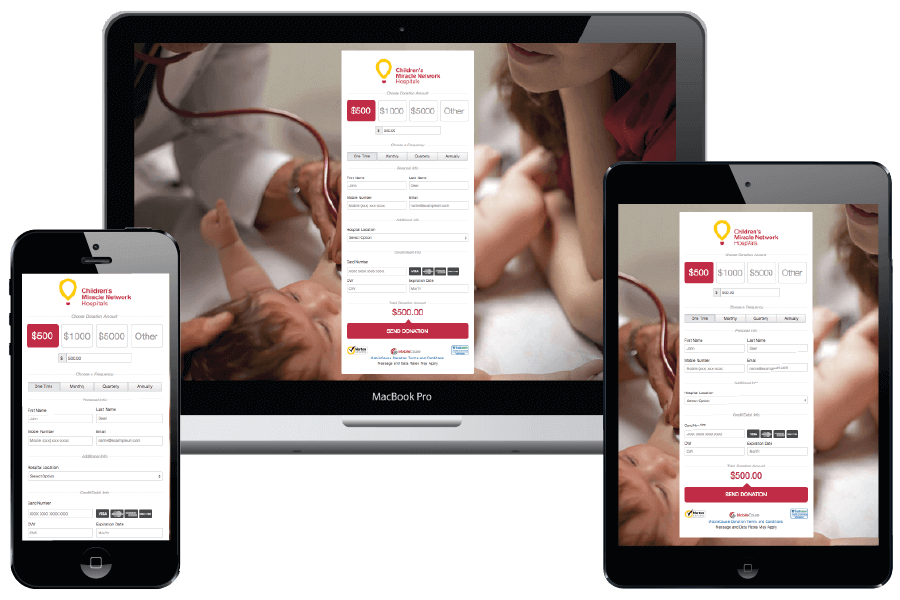
As we discussed before, it’s imperative to make the donation process as easy as possible for donors. This means meeting donors halfway, however they choose to engage with your organization.
So, your online donation form should look good and work properly on a computer, smartphone, or tablet screen.
It’s crucial to make sure that your donation form is formatted properly on mobile devices so that donors don’t have to pinch, swipe, or zoom to make a donation. Otherwise, they may give up and abandon their donation entirely!
Key point: Since donors are increasingly surfing the web via mobile devices, it’s imperative to make sure that your donation page looks good and functions well across all types of technology.
Organizing payment amounts and types
Common error #6: The donation form doesn’t offer multiple payment amounts.
No one likes to feel forced into one particular choice. People tend to prefer having several options so that they can make the most informed choice based on their circumstances.
The same concept applies when choosing to give money!
Only offering one or two specific amounts to give on your donation page will discourage potential donors because they may feel pigeonholed.
Some will think the options given are too high and therefore may decide to forego making a donation. Others will feel that they want to give more, but are unwilling to donate via multiple transactions. They, too, may therefore choose not to donate (or end up giving way less than they intended).
The fix: Give potential donors a variety of donation amounts to choose from.
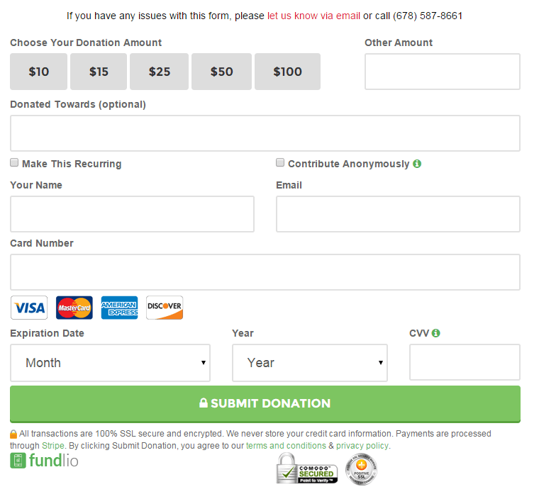
It makes logical sense to offer a range of options from which donors can choose. Incremental increases in donation amounts will help ensure that you are reaching donors at all giving levels.
But did you know that offering a variety of donation amounts can actually help you raise even more money?
People who arrive at your site may have a specific donation amount in mind, but if they see an amount to choose that’s pretty close, they’ll opt to donate a little bit more than what they initially intended.
They feel good about their decision to give, and you feel good because your nonprofit received a higher donation!
Key point: Offering multiple donation options gives donors at all giving levels options to choose from and also may help you raise more money overall.
Common error #7: There is no recurring donation option.
If your nonprofit is like most, you’re probably receiving over half of your donations from supporters who give once and then never give again.
These kinds of “one-and-done” donations are all well and good, but shouldn’t you be trying to keep your donors giving?
The fix: Offer donors the choice to auto-renew their donations.
Giving donors the option to make a recurring donation is a great idea to help retain donors who are interested in contributing on a more regular basis.
With this option, donors do not have to come back to make a new donation each month. Instead, you are doing the heavy lifting for them.
Make sure to offer a range of recurring donation choices. Options could include:
- Weekly
- Monthly
- Quarterly
- Semi-Annually
- Annually
Not only will this help boost your donor retention rates, but it may in time actually lead to bigger donation amounts. It’s been demonstrated that donors who regularly give to nonprofits are more likely to eventually choose to make a major gift. What better way to get and keep donors than to give them the choice to make recurring donations?
Key point: Include a recurring donation option to help retain donors who are interested in giving more regularly.
Common error #8: Donors do not feel secure entering their personal information on your site.
You are probably intimately familiar with the rules and regulations in place regarding nonprofit compliance. There are countless laws governing how nonprofits operate, accept donations, and process payments.
However, the average donor may not be aware of what nonprofits are required to do.
To a potential donor, it may just look like your donation form is taking valuable credit card and personal information without any guarantee of security or privacy. This lack of trust may discourage them from giving online at all.
The fix: Include information about how donor information is protected on the donation page.
To help alleviate any concerns about information sharing online, mention how your organization protects donor information by placing security logos and certifications on your donation page.
One of the most widely-recognized security certificates is the PCI Compliance indicator. Maintaining PCI (Payment Card Industry) Compliance simply means that your donation form is up to code with the payment card industry’s standards.
Having such visible indications of how your donation form values and protects donor information will go a long way towards reassuring donors that giving online to your organization is worth the risk.
Key point: Make sure to add in information about how your organization protects donor personal and financial information to alleviate any concerns about sharing personal details on the internet.

Follow-up
Common error #9: Contact with donors stops after the donation is secured.
Congratulations! You’ve successfully obtained a donation.
But your work is not quite done yet!
It’s easy to disengage once a donation has been made, but neglecting to follow up with your donors after they have given is a common mistake.
The fix: After a donation is made, say thank you!
We’re conditioned from a young age to always say “please” and “thank you.” It’s common courtesy, after all.
So why would you ever forget to thank your donors after they have given to your organization?
As has been mentioned in a previous blog post, “all of your supporters deserve to be thanked, no matter how big or small their contributions.” Your nonprofit wouldn’t be able to function without the support from each and every one of your donors, and that deserves to be recognized.
Most donation form software providers make this step even easier by automating acknowledgements. You are often able to choose an option that immediately generates a thank-you email after a donation has been made.
To make this even more effective and to show donors just how much they are valued, follow up on these automated thank-you messages with a more detailed or personalized note.
Following up with your donors also provides a perfect opportunity to give them more information about how to get more involved with your organization. After all, they already donated, which means they are interested in your mission. They may want to get even more involved but aren’t sure how!
Key point: It’s always a good idea to say thank you — especially when it comes to donors!
With these helpful tips, you should be well on your way to creating a successful donation page to accept online donations to your nonprofit.
Still have questions? For more in-depth information about some of the best online donation tools out there, check out Salsa’s comprehensive guide.


